Depop UX Redesign Case Study
Depop UX Redesign Case Study
Depop UX Redesign Case Study
Depop is a peer-to-peer shopping marketplace app based in London, England, made for users to buy and sell unique items worldwide (i.e. clothes, shoes, accessories). I saw an opportunity to redesign parts of the app.
January 2021 - February 2021
January 2021 - February 2021
UX Design Concept
Mobile UI
UX Design Concept
Mobile UI
App Audit
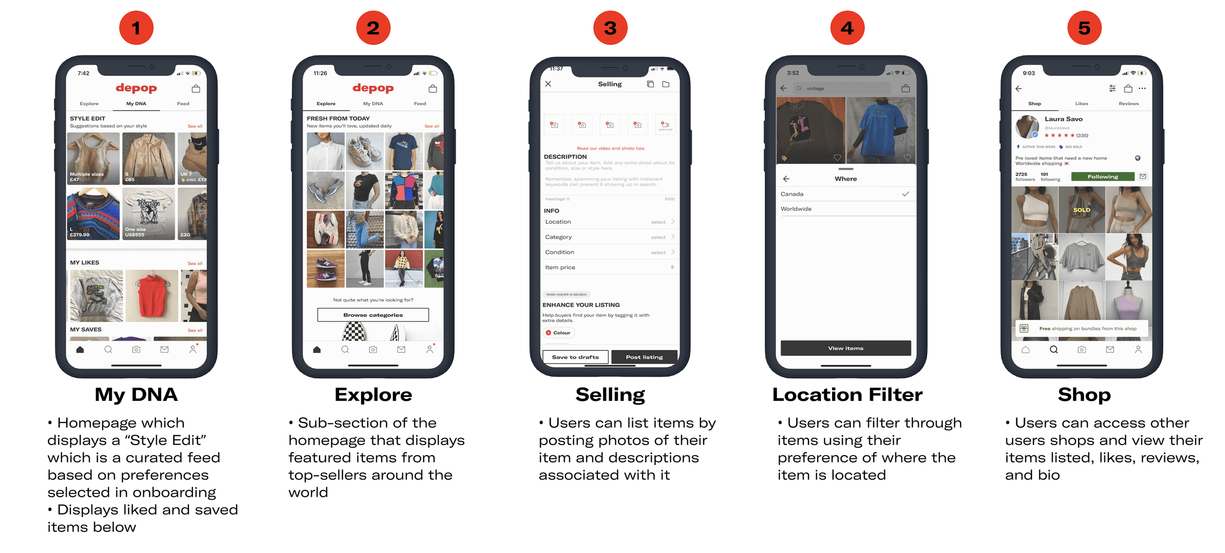
Since I already use Depop, I decided to further depth the current experience by conducting an audit of the mobile app. I wanted to understand further why I wasn't using the app by looking at all areas of the app and pinpointing any pages that lacked meaning.
Through my analysis, I was able to identify inconsistencies in the app that bring up usability issues that hinder the shopping process. Here, I listed features of the pages that first came to mind while looking at the app, that were to be further validated with user research.
Why Depop?
I have been using Depop for over three years to buy second-hand items and occasionally sell clothes that I no longer wear. I recently noticed on the app store the amount of negative and low reviews, so I wanted to dig deeper into this problem. This is my first redesign case study, and I thought, what better app to redesign than an app that I have been using for over three years.
Problem Space
Ideating a way to improve Depop’s overall user experience due to pain points regarding filtering through items, accessibility, and shopping preferences.
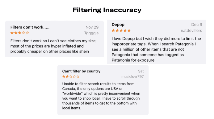
App Store Reviews
I looked at the App Store reviews to look at how existing users feel about the app. The following are some reviews that I felt was relevant to redesign Depop.
I looked at the App Store reviews to look at how existing users feel about the app. The following are some reviews that I felt was relevant to redesign Depop.
I looked at the App Store reviews to look at how existing users feel about the app. The following are some reviews that I felt was relevant to redesign Depop.
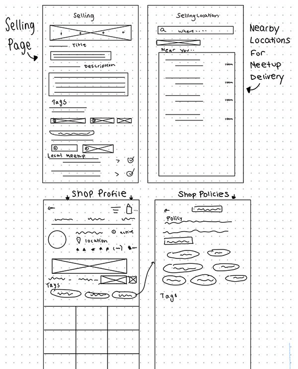
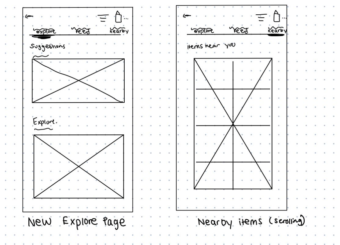
Sketching - Low-fidelity -> Mid-fidelity Wireframes
Solution
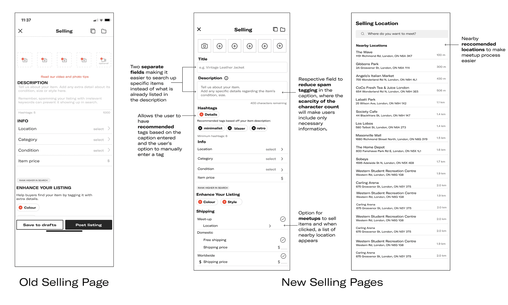
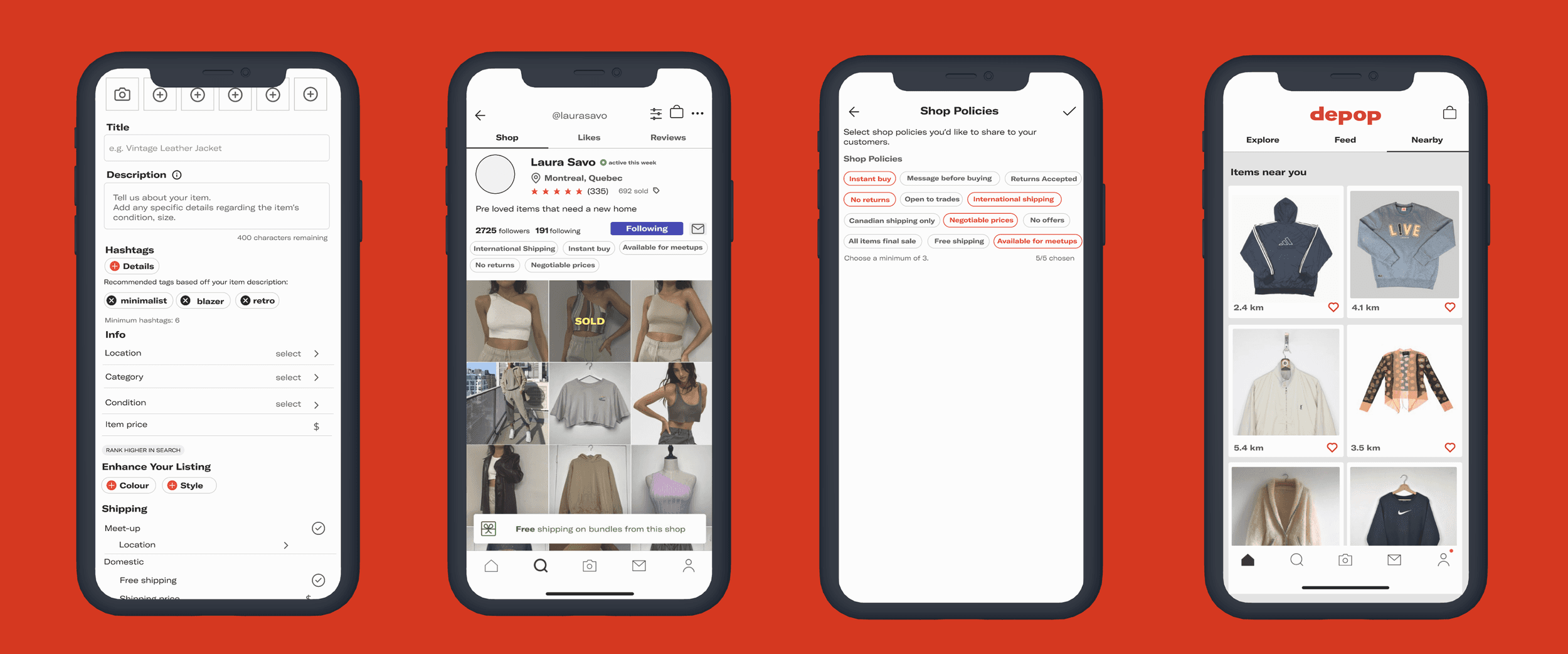
I decided to differentiate the description and the title and put two separate fields for them because it will make it easier to search up specific items instead of what is already listed in the description. Creating a respective field for the description reduces spam tagging in the caption, which was one of the users biggest pain points, trouble with accurate filtering.
I decided to differentiate the description and the title and put two separate fields for them because it will make it easier to search up specific items instead of what is already listed in the description. Creating a respective field for the description reduces spam tagging in the caption, which was one of the users biggest pain points, trouble with accurate filtering.
User Personas
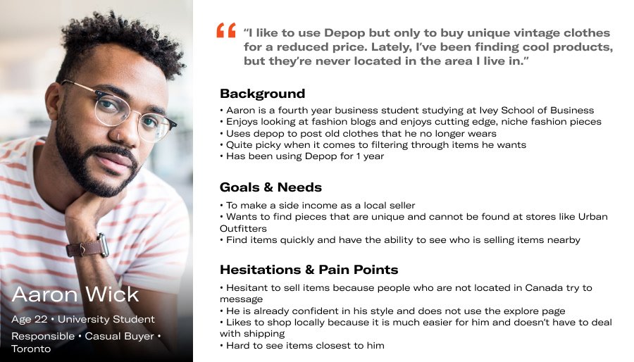
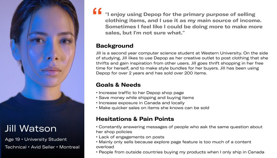
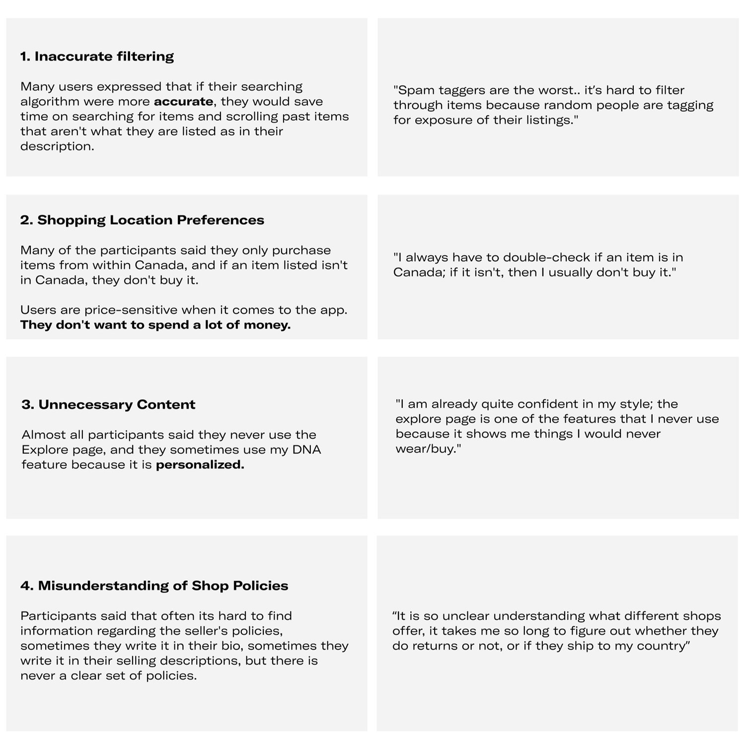
I created two personas based on the user interviews I conducted and the App Store reviews I found. From my research, I discovered there were two main types of users of Depop; the Avid Seller; Jill and the Casual Buyer, Aaron.
User Interviews
I wanted to empathize with existing users of Depop and see how they view the app. I conducted one-on-one video call interviews with six users, who range from active buyers/sellers to people who only use the app once in a while. I decided to do six one-on-one interviews, since I noticed there are two distinct users on the app; buyers and sellers. Depop's demographic comprises almost 70% of women, so I decided to interview four women and two men, ranging from ages 18 to 25. I felt this was a fair representation of the Depop demographic.
I asked specific questions such as; how often do you go on depop, what the user's use depop for, and the detailed list of questions can be found here.
• To improve the overall navigation of the app and to increase user engagement.
• Empathize with a variety of Depop sellers to understand their needs.
• Learn how to conduct and analyze user research, improve design skills, and to be able to work through a process to come up with a solution I am proud of
My goals were
To improve the overall navigation of the app and to increase user engagement.
• Empathize with a variety of Depop sellers to understand their needs.
• Learn how to conduct and analyze user research, improve design skills, and to be able to work through a process to come up with a solution I am proud of
Ability to Filter Items Nearby
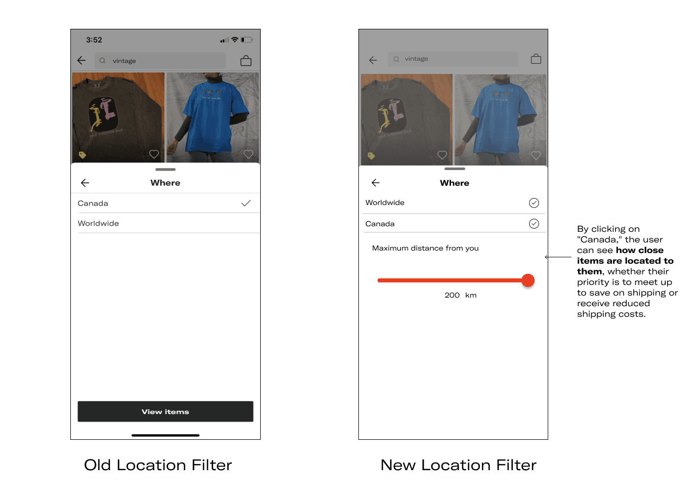
To increase product discovery, users can now see how close items are located to them. From my user interviews, many users will frequently say they use Facebook marketplace so they can sell items since they can filter by distance, and so users can find products they like and more close to them, helping them find the product quicker.
To increase product discovery, users can now see how close items are located to them. From my user interviews, many users will frequently say they use Facebook marketplace so they can sell items since they can filter by distance, and so users can find products they like and more close to them, helping them find the product quicker.
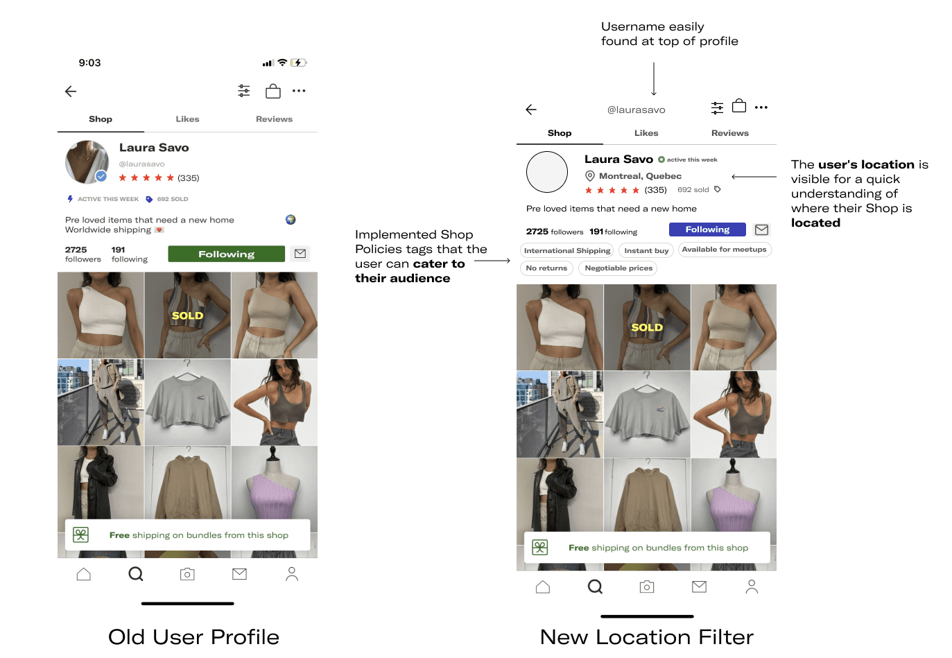
Here I redesigned the users shop page by implementing a "Shop Policies" feature that allows other buyers to understand the sellers standard policies regarding sales. The key pain point that I kept in mind while designing this was users expressing how there is usually miscommunication between a sellers profile to the buyers, especially whether they ship within their country, thus I added the option to display your location.
The shop policy tags are some of the most common statements put in most sellers' bio's or in their caption. Shop policies generate traffic to users pages, and reduces buyer questions, speeding up the buying process by already having information displayed on their page directly.
• To continue to perfect this design, in the future I would test my design with the users I previously interviewed to see how they interact with each new feature, to correct any improve issues.
Learning Outcomes
Next Steps
• When deciding to embark upon an idea, it's essential to evaluate all possible features that come to mind to ensure that I don't miss out on any important ones.
• Creating user personas after interviewing users is helpful to represent the key audience I am designing for.
• Design is an iterative process, that takes a lot of work to come to a final product.
Problem Space
Ideating a way to improve Depop’s overall user experience due to pain points regarding filtering through items, accessibility, and shopping preferences.
Since I already use Depop, I decided to further depth the current experience by conducting an audit of the mobile app. I wanted to understand further why I wasn't using the app by looking at all areas of the app and pinpointing any pages that lacked meaning.
Through my analysis, I was able to identify inconsistencies in the app that bring up usability issues that hinder the shopping process. Here, I listed features of the pages that first came to mind while looking at the app, that were to be further validated with user research.
